Hi team, any news on an updated release date for the template experience? Looking to keep our team in the loop.
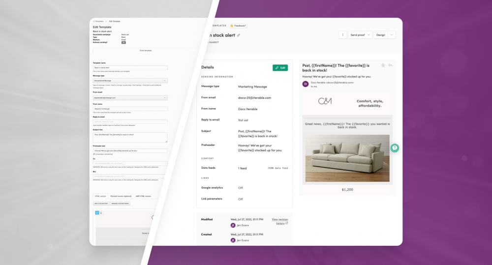
Casey Kohner, thanks for asking. Your team can expect these changes to be reflected at the end of August, we’ll have your CSM connect with you on a specific date. In the interim, here’s something to share with the team so they can get prepared:
https://support.iterable.com/hc/en-us/articles/8087854374036
Hi team, any news on an updated release date for the template experience?
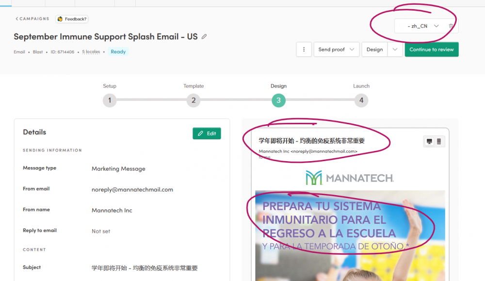
Iterable New template experience was launched and I'm having some serious caching issues with the locale in the design (3) section and the template design window.
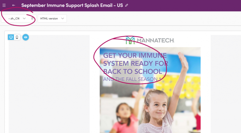
ie: creating Spanish in the template Design window and then saving and then selecting English but it's Spanish now. Until I get out of the template design window and back into "design" section (where subject lines are added) and then it shows English and if I click on it for template design then it's English. Same with Chinese. I was in Spanish, I added Chinese and it showed Spanish in the design section but when I clicked into the template design window it was in English. Very concerned I'm making updates to the wrong locale at this point...
Design section, Chinese local, Spanish version
Template Design Window, Chinese locale, English version (this is what would be expected as it should clone English by default but now I'm concerned based on the design window our Chinese customers would get Spanish...
Thanks Stacey Wirtjes for flagging this. I've opened a support ticket and we'll get the team looking into ASAP!
Quick 2 part feedback as request for enhancement.
Part 1: Side by Side editor
Working in the side by side editor. That is a nice addition. Code on the left. Preview on the right.
So the preview on the right shouldn't have have active links. That's what preview drop down by the design button is for where you can load your test email cases.
The right side of the side by side should be set up to where if you click anywhere on that section of your previewed emails, it takes you to that section of code on the left so you can quickly get to what needs edited. It saves you from having to scroll & scroll on the left looking through trying to identify the section you want to edit.
As it is now, if it's a linked image, you click on that and it's taking you to what that link is. It basically should work exactly how Litmus's editor is set up.
Part 2: Image uploading
I will edit this if I discover otherwise but it appears you can only upload images in the WYSIWYG editor. Not the side by side.
Previously in the side by side editor, you would right click an image and select upload image and it would replace your existing image. We had templates set up with placeholder images. Now you cannot upload images from this section of the editor. It looks like only from the WYSIWYG editor.
From that editor, there's the insert media button where images are added to your existing template. Not replacing our already existing templates with placeholder images that are hyperlinked.
There really just needs to be a section in Iterable that is a designated image library where you can track what you've uploaded, copy the URLs of those images to insert in the side by side code any time you like.
The new UX is cool! My only gripe is with the code editor.
I do a lot of my email work in the source code & I really miss the old code editor. I like that it was a black background and it auto-indented my HTML code. It made troubleshooting and testing easy & effortless. It was easy to navigate and find code that I need to change on the fly.
The new code editor is very hard on the eyes. A white background & non-indented code causes a lot of eye fatigue and makes troubleshooting a lot more difficult. I have to hunt for the section I need to fix, and with the white background, it's already hurting my eyes. It's adding more unnecessary time to my dev work.
Please bring back the black background and indented code!
Noticed the new experience today and while I do like the idea of an improved workflow and experience (similar to the excellent journeys update), it adds quite a few steps that may make the process quite slower than the previous experience. The New Templates Experience mentions to "Say goodbye to multiple tabs...", but it feels like for some users that has been replaced with multiple windows and popups and steps.
For example:
In the old experience one could click on a template or campaign and immediately change subject lines, scroll down and edit html or edit via the wysiwyg editor. Click save, move to next locale, rinse and repeat. Older UI for sure, but at least fast and in one screen .
In the new experience, you're first greeted with the new Details screen and if you want to edit copy here, you'll need to click 'Edit', update copy, click save, change locale, click edit, update copy, etc. If you want to change copy and html & creative, you need to click Design, load new screen, and then work from there. What I noticed in this new design view—which has some great elements to it—it feels like it moves away from the hybrid code/wysiwyg (or intermediate/advanced) ability the old experience had, and instead provides either a Wysiwyg or Side-by-side (code) view with no hybrid of the two. So you either code with an uneditable preview to the right (making quickly adding images harder), or use the wysiwyg screen with a minimal code editor popup. Both views require you to open a new popup window to the left to edit subject lines.
The old experience—as it was on one screen—provided a global save button for subject lines, code edits, and wysiwyg updates for that locale, whereas the new one has a save button for each new window or popup you may be editing. Small criticism maybe, but when working fast and on a lot of templates the extra buttons and window/popups steps can really add up.
An example for these added steps, if you're on the final Review screen and need to make html updates, you need to click 'Go Back to Design', load Details screen, and click the the 'Design' button here to make changes in the Design Screen. Or if you're editing html in the Design screen and want to reload an older version, you need to go back to the Details screen and then load a revision from there. Maybe it's just me, but this Details screen feels bit like the final Review screen, and in that adds a new window/steps to the overall process that might work better combined or made optional. The 4 step timeline is now more of a 5 step timeline with the #3 Design step diverting you to a Details page first.
As Steve Soper mentioned above, image uploading has now changed quite a bit. There's currently no place to upload images in the Side-by-side view, and in the Wysiwyg view it's now changed from double clicking an image and uploading and applying in the popup, to having to click the 'Insert Media' button, upload a new image via the popup and then add, all while making sure you have the right table/div selected otherwise you load an image to the wrong spot in your template. Even the best of us move quick and miss things, and in this case double clicking the image you wanted to change felt so much quicker and ensured you were adding or replacing the right image. There's also no place in this new 'Insert Media' popup to copy the link to the image as the old one provided. This is useful, as one may want to use the link in an email or even add to the Rich Push media url (as I'm not seeing an upload image button for rich pushes in old or new experience). Not sure if this image upload experience affects many as it does those with image heavy emails, but what I'm noticing so far is that this adds considerable time to our new template and cloned template creation.
I will say I like the direction this new UI is going, but I really wish this update waited until after the holiday period. For high volume eCommerce, a change in process like this feels better suited outside of holiday.
Steve Soper Thank you for insightful comments and for detailing the requested enhancements for the side by side editor and image uploading. We've shared these requests with the team and will look into this ASAP.
Yonder Buslon we think it’s cool too but can totally see how you would prefer the previous background and auto-indent. This feedback has been relayed to the team and we will continue to work on these improvements.
Josh Geiser Hi Josh. Appreciate your feedback on this AND the recent journeys update. We're continuing to add even more functionality to Studio, so do keep an eye out for those.
Your comments and detailed feedback on the editors and also the timing are also valuable and something we'll be considering. We've passed this on to the team and will be addressing with follow-ups.
I just opened a ticket on this, but has anyone else noticed major issues with this new template/editor experience? To test this, I opened a previously sent campaign and previewed on devices. All was fine.
Then I copied the campaign, edited and saved the design with no changes made to the code or anything at all. Previewed on devices and there were serious rendering issues in many clients. So for some reason, the new WYSIWYG design editor is not saving the same code that it is given.
I do pure html because I do things you cannot do in the editors, then others can make simple changes in the WYSIWYG. So this is a rather big disruption to us.
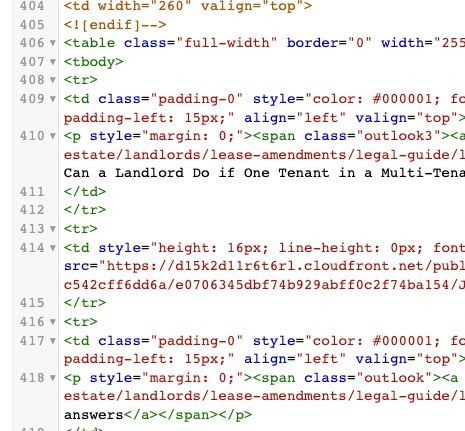
Hi David Calhoun thank you for highlighting this. We received some reports for how the new WYSIWYG editor was handling conditional comments. This was impacting rendering if you use conditions like