All Iterable community members are welcome to join in on this challenge!

Congratulations Kahoot members, you made it to the final challenge! 🎉

I hope that you feel empowered and knowledgeable about Iterable’s capabilities, support, and services to help bring your customers joy. 

Here in the Iterable Community, we love to start conversations, share knowledge, and highlight marketing moments.

In honour of Activate Summit Europe, for your last challenge, we want to dive into marketing moments that have brought delight to your lives.

👉🏾 Activate Summit Europe is for the marketing masters involved in bringing customers a delightful experience! That's right, we want you to Share your favourite campaign that has brought delight to your life, and follows 1-3 best practices.

👉🏾 Think back to an email that has made your day by either making something easier to accomplish, inspiring you, helping you to learn something new, asking for your opinion, or celebrating your milestones.


I’ll go first!

Email Subject: Pro tips for your recent purchase inside, Deja ➡️

Why I love this lead-nurturing campaign:

Follows three best practices for surprising and delighting customers:

  1. Effective subject line: Catchy and relevant subject line. The bonus point is that it was personalized.


  2. Educational content: Help people learn more about the application process for recent purchases. 


  3. Engage Customers: Introduces other ways to engage with the brand by joining their community for online tutorials.


Untitled.png

Now it's your turn!

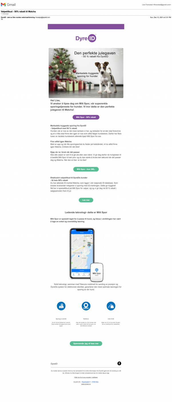
screencapture-mail-google-mail-u-2-2022-05-13-10_50_54.pngEmail subject: Valpetilbud - 50% rabatt til Matcha 
(roughly translated:offer for puppies - 50% off for Matcha)

Why I love this lead-nurturing campaign:

Follows three best practices for surprising and delighting customers:

  1. Personalized content: Not only did they address my name (Lise) and my puppy’s name (Matcha), they also offered a significant discount on a service extremely relevant for me as a puppy parent.


  2. Educational content:  My puppy was at the time around 5 months old and was distracted (and still is) by every possible thing in her surroundings (e.g a snowflake, a bird flying by, a stick etc) so she would suddenly sprint off. I had been looking for a way to track her if she ever was to take off on her own adventure. 


  3. Concise messaging above the fold: Offering, image and CTA were all descriptive and to the point and included all the information I needed to make a decision. No unnecessary fluff. 


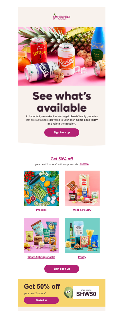
Email Subject: Come back and get 50% off your next 2 orders! 💰

Why I love this lead-nurturing campaign:

Follows three best practices for surprising and delighting customers:

Concise subject line: 50% off?! That eye-catching! The clear and definitive numbers help me know exactly what I 'get' for opening up the email.

Clear CTA: The "Sign me up" clearly reflects and coincides with the subject line. I also know I'll be directed right to my account page with no chaotic clicks or navigations.

Engaging Visuals: The visuals in the email are actual items/bundles I've purchased before. I'm drawn in by both nostalgia...and hunger!

Screen Shot 2022-05-13 at 1.01.46 PM.png


Email Subject: Easy steps to get that fresh-face look

Why I love this lead-nurturing campaign:

Follows three best practices for surprising and delighting customers:

Educational content: I know that I am going to learn exactly how to get a fresh-faced look in easy steps! The way it teaches me within the email is also segmented really clearly and I can choose whether I want to focus on skin, lips or brows. The fact that I also don't necessarily have to read the content and looking at just the images gives me almost all the information I need is great!

Clear user benefit: I immediately know what I am going to get when I click into this email. The word "easy" catches my eye and the headline of the email is short and concise once I open it.

Visually pleasing: The balance between images and words is nice in that it's not too heavy on one or the other and they balance the page out nicely.

Screen Shot 2022-05-13 at 2.49.19 PM.png


Lise Framstad

Lise, I love that they personalized the email for you and Matcha! 🐕

Agreed! Educational emails that are short and provide the most important points make it easier to make a decision. Glad that they were able to help you find a tracker for Matcha.


Hannah Harris

Hannah, wow the colors of the visuals are stimulating my hunger right now too. Yes! I agree that the email subject was eye-catching. I love that the email subject answered right away what's in it for you before you opened the email. I'd be more curious to open the email!


Amanda Taselaar

Amanda, I like that they used images as a roadmap for easy steps to get a fresh-faced look! This email definitely made this process look easy with the balance of images and words as a step-by-step process, easing the decision buying process for a new skincare routine.


Reply